Exercise 8 - Exploring future climate data projections
Understanding what our future climate might look like can be confusing. There are many models, emissions scenarios, time-windows of interest, and variables that we need to understand. Traditionally the output from Global Climate Models (GCM’s) is also very complicated and requires sophisticated data analysis scripts to load and process the spatio-temporal data to something able to be used in impact assessments. In this exercsie we aim to use the CCIA data tool, which provides a user-friendly interface that allows users to extract and interpret data in a simple way.
Learning Objectives
To be able to source essential information on future climate conditions for a chosen area in Australia, and appreciate ways to compare future climate projects and communicate uncertainty.
Making a simple summary plot with the CCIA tool
Goto the “Summary Data Explorer” tab.
- Click on a region on the map.
- In the pop-up, select the variable of interest to view the seasonal bar-plot.
- Download the plot and under-pinning data by clicking on links. Have a look at the seasonal changes in temperature, evapotranspiration and rainfall. What do you notice? For rainfall, are some seasons more impacted than others? Is the range predicted by models smaller or bigger than the projected change? Make a summary paragraph – something that is concise and understandable but also informative – explaining the nature of climate change at your selected location.
Threshold exceedance
Now let’s consider how the frequency of crossing thresholds changes. Whilst the occurance of an “extreme” event (e.g. drought or flood) is rare, the rate their frequency of occurance may change can be disproportionally large compared to, say, the change in the mean (Refer to slide 3 of Lecture 8).
Goto the “Thresholds Calculator” tab.
In the Configure Data section:
- You can select a VARIABLE from the drop-down list – start with MAX TEMPERATURE
- Select a THRESHOLD LEVEL from the drop-down list – select 35 C
- Select a MODEL from the drop-down list
- Select an EMISSIONS SCENARIO from the drop-down list – start with RCP8.5
- Select a TIME PERIOD from the four choices in the drop-down list – use 2050
- Select a SEASON from the drop-down list – use ANNUAL
- Click REDRAW MAP to display the results (there will be a short delay). A map of the gridded results and locations (grey dots) displays and the Select Locality selector becomes active.
- Choose a location on the map or select from the Select Locality drop-down (if desired) to bring up a table comparing historic with future information.
- In the pop-up box showing the results from all models, note the AWAP (historical) value (eg 17 days). Now copy the results from the models and paste into a column in an excel spreadsheet. Label the column in Excel with the RCP level.
- Repeat Step 4-9 for the other RCP values. Once you have a table of data, make a nice graph.
- You can repeat the above for specific seasons and variables.
Spatial gradients in climate trends:
We can also access the direct outputs from the model gird (at the land surface level), giving us an appreciation of the spatial variability and “patchiness.”
Goto the “Map Explorer” tab.
- Think about Assessment 3 part C. Then:
In the Configure Data section:
- Now select 2050 TIME PERIOD, and set the VARIABLE to Rainfall. Select a MODEL (e.g., ACCESS).
- For Both RCP4.5 and RCP8.5 draw a map of south-west WA, and re-do this for each season. For each map, note down an approximate rainfall % change for the region around Perth.
- Note the “pixel” size – these results are from a GCM. What sort fo pixel size does your chosen model use? How could we get results at a higher resolution?
- Consider your Assessment 3 CC scenario, and the data in the SWSY report. How do these results compare?
Climate trajectories:
Goto the Time Series Explorer section.
- Follow the instructions to set the time-series graph details, in order to prepare a future trajectory of temperature and (winter) rainfall for a chosen region and RCP. Is there a crtiical year where anomolous conditions start?
Climate Futures Tool:
By now you appreciate that climate change cannot always be summarised by applying a simple factor or multiplier. The CCIA Climate Futures Tool allows projections to be classified by the combined changes in two variables, with the data usually presented in an easy to understand colour-coded matrix.
Importantly this approach is a way of dealing with uncertainty – the more models that agree with a certain level of “change” the more likely that is to occur. That doesn’t mean the less common outcomes are wrong, but on the balance of probability, the more models that agree suggests the likelihood of that outcome is higher.
For a region of your choice, work through using the Climate Futures Tool; following the instructions provided to prepare a summary matrix such as the one below.
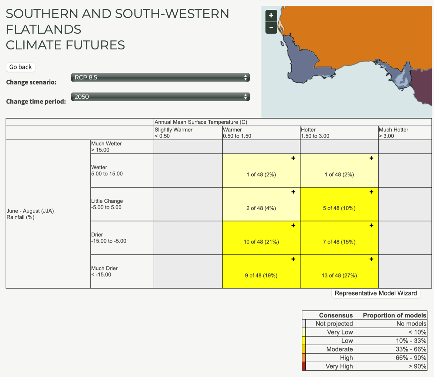
Figure 22: Example output matrix summarising the frequency of model predictions of a certain outcome. Where models agree the liklihood of that outcome is high.
Conclusions
The activity (a) helps us appreciate the complexity in trying to anticipate what the future might hold for a certain region of interest, and (b) gives you an (Australian) example of where you can easily get data on Climate Change information.