Learning to plot with python
In this module, we follow a similar process to plotting with R and R tidyverse.
Visualising Module 1 Flow Data
Setting up
Creating a .py file with VS Code
- Refer to the Getting Started section, to install python and its packages, as well as Visual Studio Code (VSC)
- Open Visual Studio Code, the go File -> Open Folder then open the folder where you will store your files for this exercise (ENVT3362_workshop_2)
- Download the spreadsheet for this workshop here
- Move this to your ENVT3362_workshop_2 directory
- Make a new python file in VSC. Go File -> New File -> New python file and save a file as a ‘.py’
- Open two new terminals in VSC. Open one as python and one as Powershell.
- To use python in the python terminal, use a python command (e.g. ‘plot’). To use it in the Powershell terminal, first write ‘python’ and then the python command (e.g. ‘python plot’). If VSC cannot find python, write the whole path to where python is installed on your computer (e.g. ‘C:.exe plot’).
Importing and formatting the data
Load the necessary packages
Add these commands to the top of your python file. These are python packages that we are loading with the command ‘import’. This is similar to the R function ‘library()’. The ‘as’ command gives a shorter name to the package, which we can choose, for future reference throughout the script.
import pandas as pd
import matplotlib.pyplot as plt
import matplotlib.dates as mdates
import matplotlib.patches as patches

from datetime import datetime
Run these lines by pressing Shift Enter, one by one. This is the equivalent of Ctrl Enter in R.
If importing these packages does not work, it may be that the location of your python files is not being found. To fix this, in the VSC Powershell terminal, use a python command starting with the location of your python program location. For example:
C:\Users\Jimmy\AppData\python\python.exe
import pandas as pd
Similarly you may need to specify the whole file path to pip in powershell, for example:
C:\Users\Jimmy\AppData\python\pip3.exe Import the spreadsheet
Load the spreadsheet into your python environment. In this command, pd refers to the ‘pandas’ package, ‘read_excel’ is a python function that converts Excel to python, ‘env_flow’ is the name of the variable that we will use from now on and ‘envFlowData.xlsx’ is the name of the file that you downloaded.
env_flow = pd.read_excel("envFlowData.xls")Inspect the data
Display a header of the data.
print(env_flow) date totalDischarge
0 1992-01-01 26.599
1 1992-01-02 26.849
2 1992-01-03 27.274
3 1992-01-04 26.988
4 1992-01-05 26.463
... ... ...
6935 2010-12-27 20.005
6936 2010-12-28 20.116
6937 2010-12-29 19.736
6938 2010-12-30 19.828
6939 2010-12-31 19.617
[6940 rows x 2 columns]Format the date
Format the date in a way that looks good in the figure. Capital Y means a year with four digits, lower case y would be two digits. ‘for t’ means to apply this command to each line. This is like a ‘for loop’ in R. In python this is referred to as ‘list comprehension’. ‘strptime’ is a standard formatting for dates and times, converting text strings into a ‘date time object’.
env_flow["date"] = [
    datetime.strptime(t, "%Y-%m-%d") for t in env_flow["date"]
]
Plotting with matplotlib
Create Figure and Axes objects
The ‘fig’ is our figure object, and the ‘ax’ is our axis object. We are naming them and assigning properties to them in this step. ‘plt.subplots’ is a function from the python matplotlib library.
fig, ax = plt.subplots(figsize=(10, 6))Plot the data to the Axes object (ax)
Apply the ‘plot’ command to the ‘ax’ object that we created above. Apply the ‘savefig’ command to the ‘fig’ object that we created above.
ax.plot(env_flow["date"], env_flow["totalDischarge"])
fig.savefig("env_flow.png")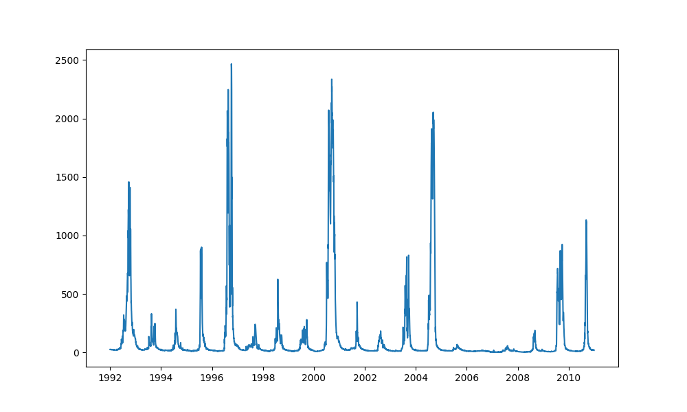
This should save a figure as a .png file, ‘env_flow.png’, to your working directory. See if you can open it and take a look at it.
Change the colour
Now that your basic plot is working, you can start editing it. It defaults to a light blue line: let’s change it to a green line by adding the parameter ‘color’ to the ‘plot’ method, to the ‘ax’ object.
fig, ax = plt.subplots(figsize=(10, 6))
ax.plot(env_flow["date"], env_flow["totalDischarge"], color="green")
fig.savefig("env_flow.png")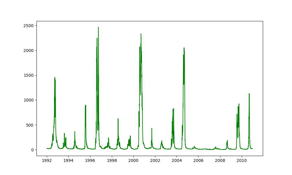
Fix the labels
Add labels to the axes, using the ‘set_xlabel’ command. Make the labels bold using the parameter ‘fontweight’.
fig, ax = plt.subplots(figsize=(10, 6))
ax.plot(env_flow["date"], env_flow["totalDischarge"], color="green")
ax.set_xlabel("Date", fontweight="bold")
ax.set_ylabel("Total Discharge (ML)", fontweight="bold")
fig.savefig("env_flow.png")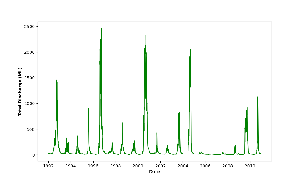
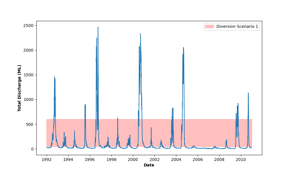
Visualising diversion scenarios
Add a pale red box to show the flow smaller than 550 ML. With ‘rect’ we set all the properties of the box, and then with ‘add_patch’ we add the ‘rect’ box to our ‘ax’ object.
fig, ax = plt.subplots(figsize=(10, 6))
ax.plot(env_flow["date"], env_flow["totalDischarge"])

rect = patches.Rectangle(
    xy=(mdates.date2num(env_flow["date"][0]), 50), # This is the bottom left-hand corner
    width=len(env_flow["date"]), # This is the length of this list (number of dates)
    height=550, # This is the volume of flow in ML
    linewidth=1,
    edgecolor='red',
    facecolor='red',
    alpha=0.25, # This is the opacity of the colour, scaling from 0 to 1.
)
ax.add_patch(rect)
ax.set_xlabel("Date", fontweight='bold')
ax.set_ylabel("Total Discharge (ML)", fontweight='bold')
fig.savefig("env_flow.png")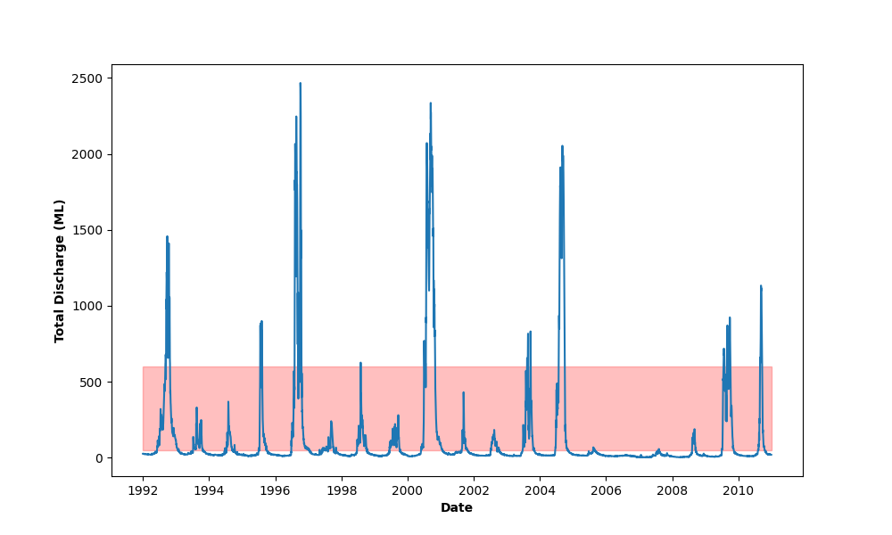
Add a legend to the diversion scenario
Add the legend to the diversion scenario, using the ‘legend’ command, which we apply to our ‘plt’ object.
fig, ax = plt.subplots(figsize=(10, 6))
ax.plot(env_flow["date"], env_flow["totalDischarge"])

rect = patches.Rectangle(
    xy=(mdates.date2num(env_flow["date"][0]), 50), # This is the bottom left-hand corner
    width=len(env_flow["date"]), # This is the length of this list (number of dates)
    height=550, # This is the volume of flow in ML
    linewidth=1,
    edgecolor='red',
    facecolor='red',
    alpha=0.25, # This is the opacity of the colour, scaling from 0 to 1.
    label="Diversion Scenario 1" # This is the text in the label
)
ax.add_patch(rect)
ax.set_xlabel("Date", fontweight='bold')
ax.set_ylabel("Total Discharge (ML)", fontweight='bold')
plt.legend()
fig.savefig("env_flow.png")